The Right Assets to Communicate Crucial Information for the American Red Cross
CLIENT
American Red Cross
SERVICES & SOLUTIONS PROVIDED


The American Red Cross is one of the most well-known non-profit humanitarian organizations in existence. It both responds to emergencies and disasters and offers education around preparedness and safety. Their mission is to alleviate human suffering due to emergencies by deploying teams of volunteers who are funded by donors.
The Opportunity
One of the many responsibilities of the Red Cross is to ensure that all of the scientific recommendations they receive are translated and reproduced across a vast array of assets—all in PDF form. These materials are then updated yearly to reflect the new science that has developed. In addition to educational materials, many Red Cross training materials, programs, and style guides also needed to be updated.
The Solution
The Red Cross worked with Iperdesign on a multi-year project to overhaul the organization’s most important assets. We moved away from old-school publishing and PDF efforts and created digital databases for Healthcare Guidelines and Aquatics which serve as the most up-to-date, living libraries of healthcare and life-saving information. These materials are consistently updated to reflect any new science as it develops. We interfaced with subject matter experts, scientists, and doctors to ensure all information was accurately represented according to the Red Cross’s scientific recommendations—in addition to being easily understood and universal in design. Finally, we oversaw the translation of materials into both English and Spanish.
Pairing Branding with Life-Saving Information and Education
The most important part of a project for the Red Cross is to ensure that the most up-to-date information is communicated clearly enough that if there’s an emergency, it can be quickly read, understood, and translated into action in mere moments. The second most important piece of the project was to ensure the Red Cross’s iconic branding was incorporated into every single piece we created—not just for brand recognition but because that branding adds the ultimate feeling of credibility when an emergency strikes or when a tragedy needs to be prevented via proper training.
This meant turning our creative design expertise into something much more technical—a database library build that conveys information in a way that anyone reading it can understand. Then, we ensured the Red Cross’s name was front and center. We executed this precision design over multiple healthcare and aquatics verticals, including first aid and emergency care.
Design Rooted in Responsibility and Education
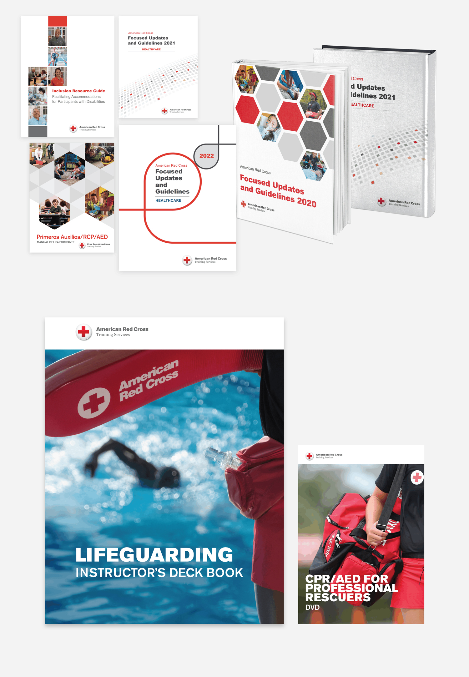
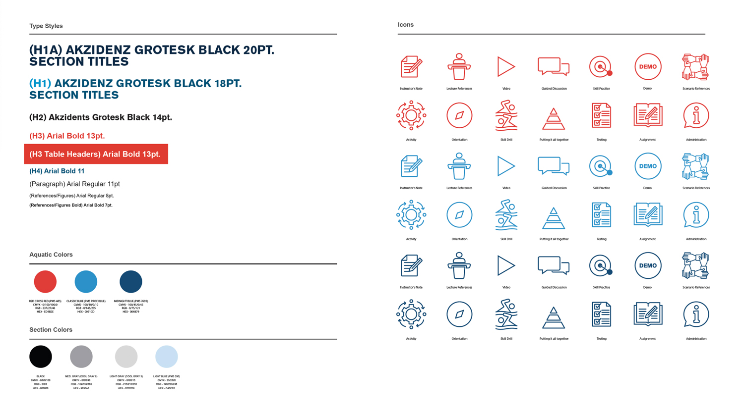
When it comes to creating informational documents and educational materials that save lives and help people, no detail is too small. We pored over everything from box size and design to colors and flow of content to ensure that the information the Red Cross needed to convey resonated with all audiences—in both English and Spanish. From there, multiple rounds of review ensured that every expert had a say in how each piece developed and its accuracy prior to publication. Then, we built out the database libraries where the assets they contained could be easily updated and serve as living documents, rather than a PDF that had to be time-consumingly updated every time there was a new piece of information.
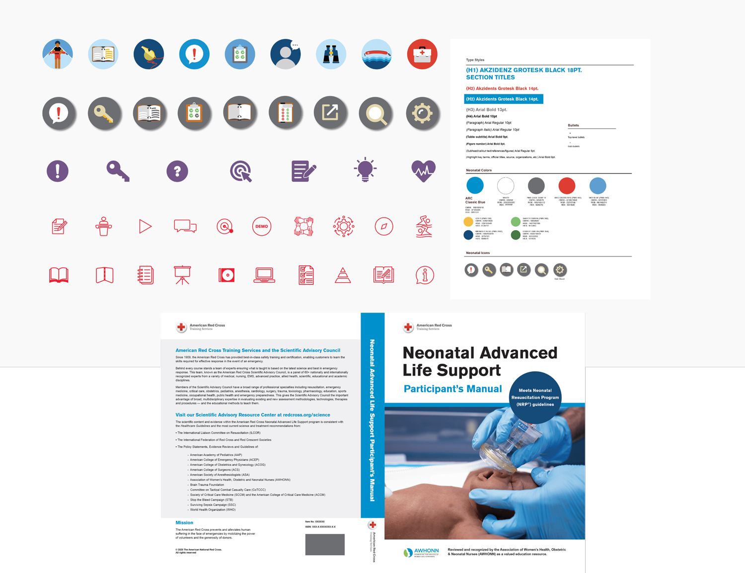
These databases we created summarize the scientific evidence and guideline reviews overseen by the American Red Cross Scientific Advisory Council (ARCSAC). They convey advancements in everything from basic life support, advanced life support, and pediatric advanced life support to neonatal life support and education. With this database platform, editors can make updates to the databases directly, saving months of production time.
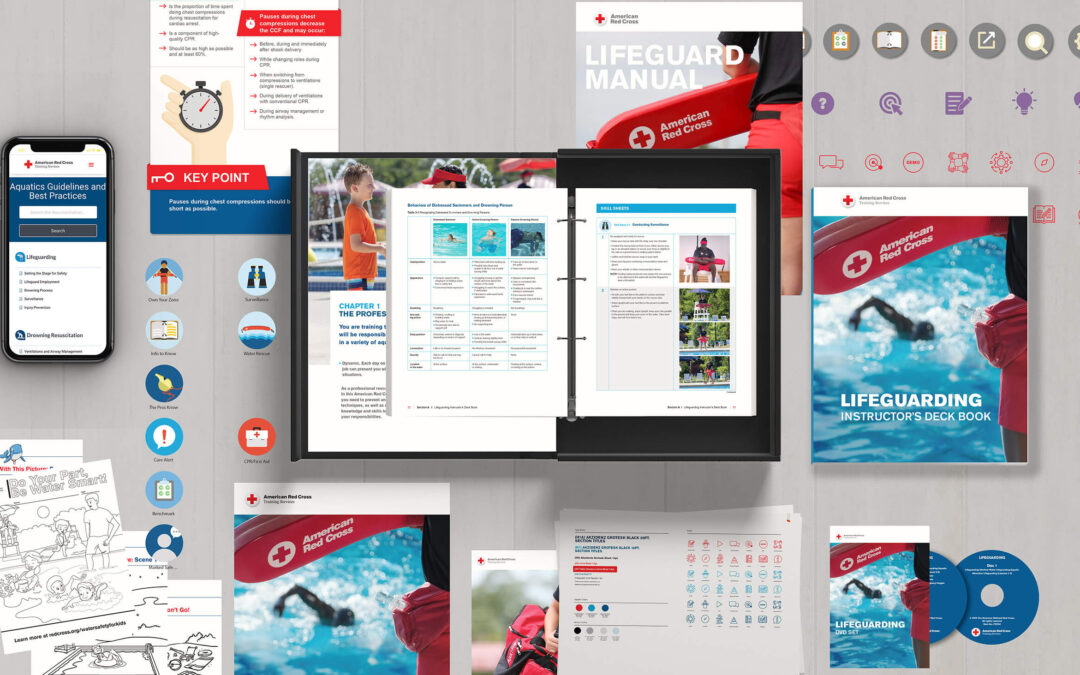
Additionally, some of the most important pieces we created in both English and Spanish include:
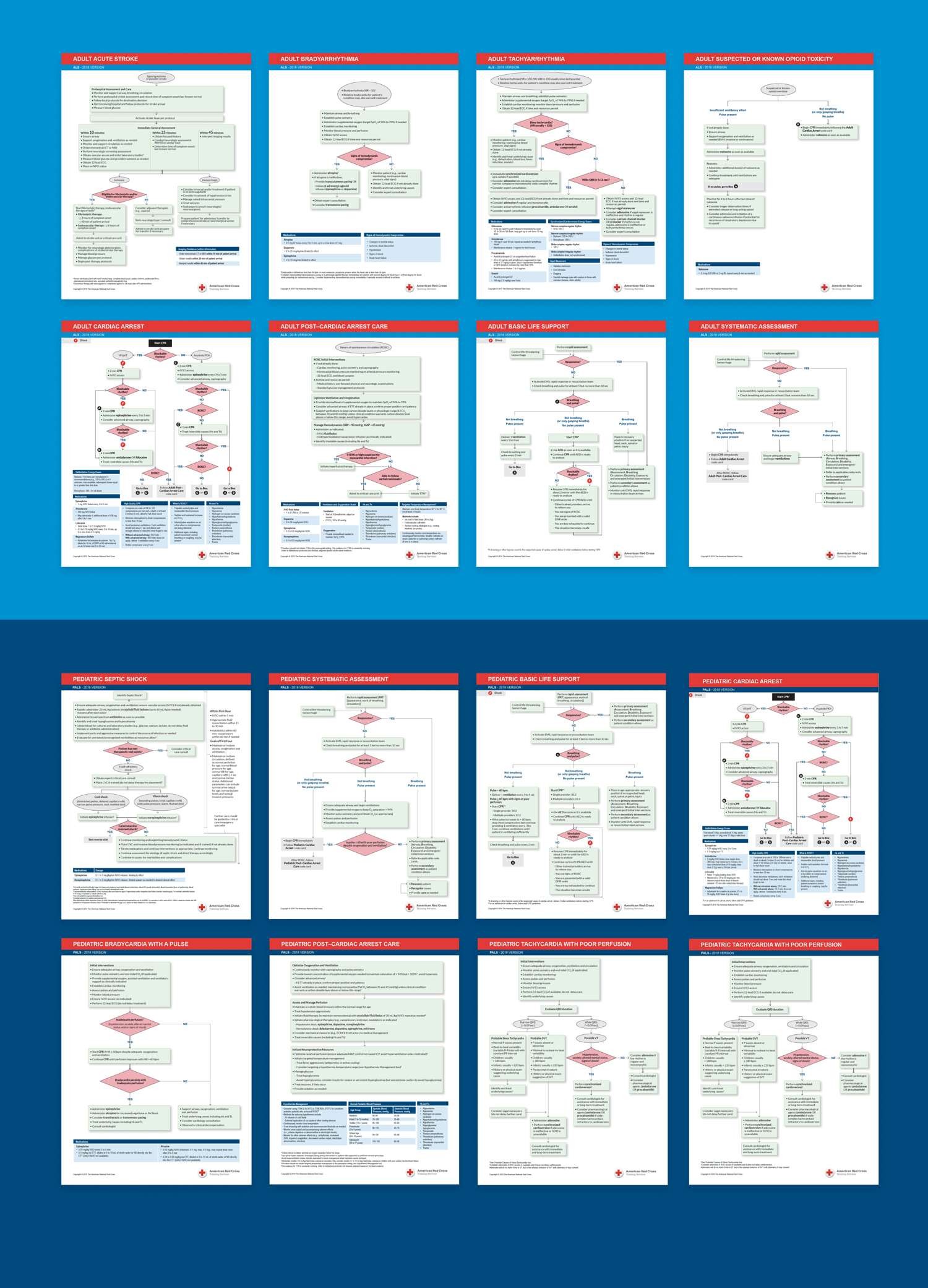
Code Cards: To easily communicate life support information to healthcare professionals, we worked with the Red Cross to create code cards for advanced life support, basic life support, and pediatric life support.
Instructor and Participant Training Materials: With over 200 pages of information, these materials ensure that instructors can train participants in procedures like cardiopulmonary resuscitation (CPR) and utilizing an artificial external defibrillator (AED).
Lifeguarding PM Design Template: Iperdesign’s design experts built this template to enable the entire Red Cross Lifeguarding Training Program to build the assets they needed to adequately inform and train participants.
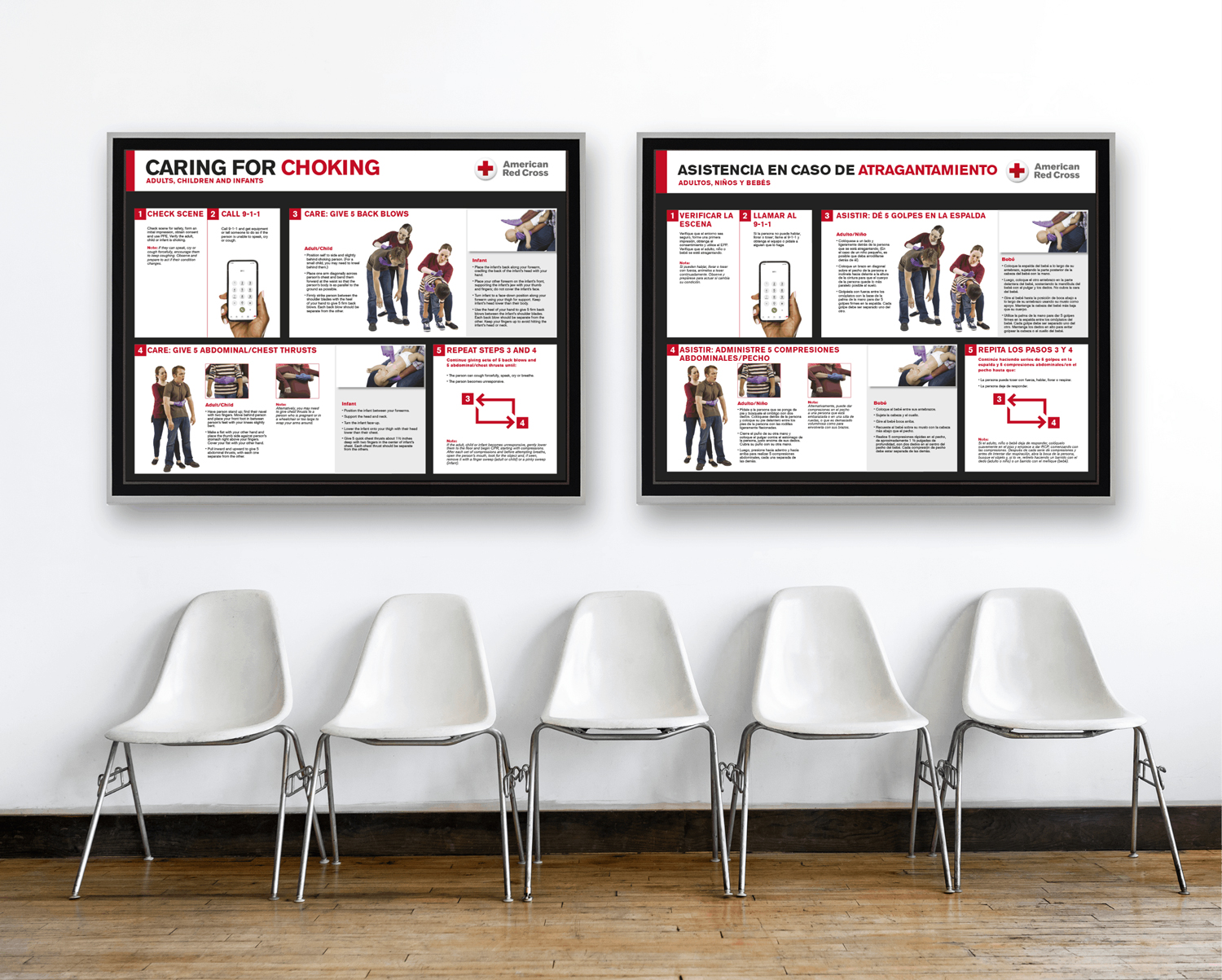
Additional Posters, Infographics, and Illustrations: From posters that accurately depict how to perform chest compressions and choking care to infographics that depict how to use point-of-care ultrasounds during chest compressions and child-friendly coloring materials to educate about water safety, we created a collection of materials to education both healthcare professionals and families.
.
Designing and Branding with Purpose for the Red Cross
It wasn’t just our mission to highlight the scientific research the Red Cross is constantly performing, it was our responsibility. Each piece we touched served an important purpose for individuals across the country and the world.
Not only were we able to design documentation that showcased both the Red Cross’s scientific innovation and recommendations, we also made course modifications to ensure their programming also included the cutting-edge, up-to-date research that is to be expected from the Red Cross. Every fall, the Red Cross receives new recommendations from its experts, and this starts our cycle of updates again.


