Recreating a Brand that Brings Hope to Families Across the Country
CLIENT
Lovaas
SERVICES & SOLUTIONS PROVIDED


The Lovaas Institute, using the Lovaas Model of Applied Behavior Analysis (ABA), has been providing behavior treatment for children with autism and other neurodivergent conditions for decades. They’ve made it their mission to research, implement, improve, and evolve teaching strategies and methods to help both children and their families navigate both interfamily and intercommunity relationships.
The Opportunity
The Lovaas Method of ABA is where you can see the Lovaas Institute’s passion and expertise. The families they help across the country have seen their neurodivergent children learn, adapt, and grow. While the Lovaas Institute had been around for decades, it didn’t have the right branding or digital presence to truly showcase the important work that they do every day. Instead, their branding and website design were dated and left a great deal for their clients to connect with.
The Solution
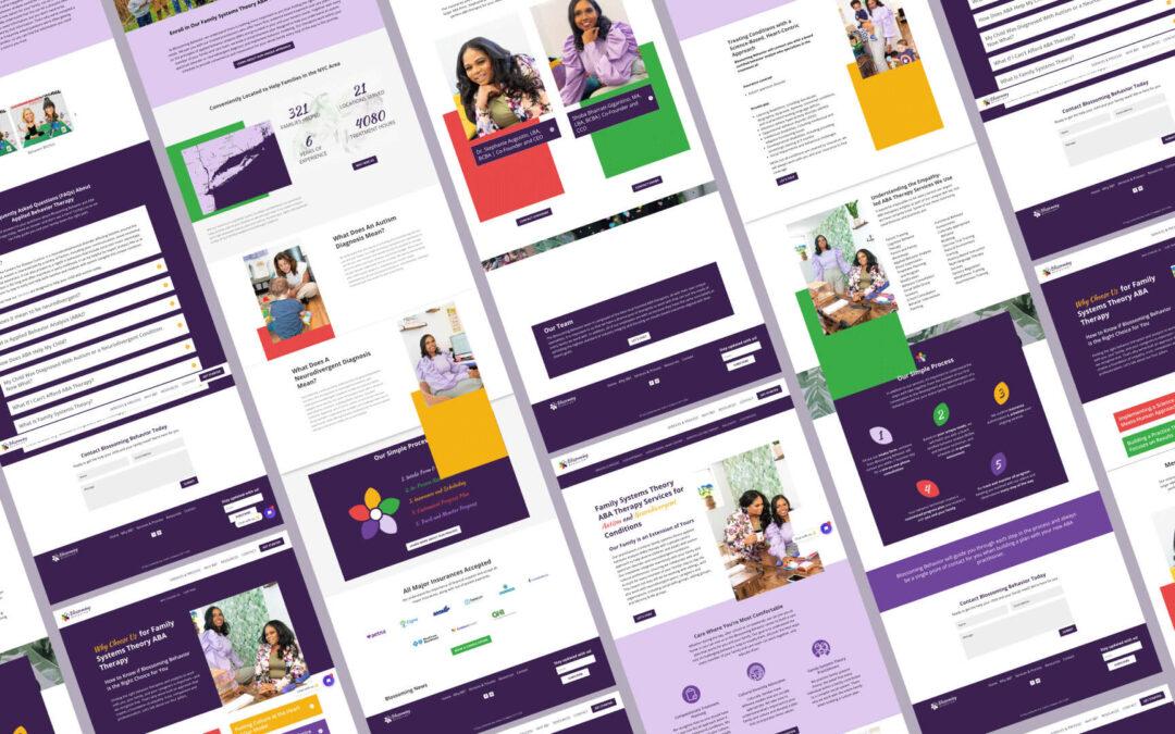
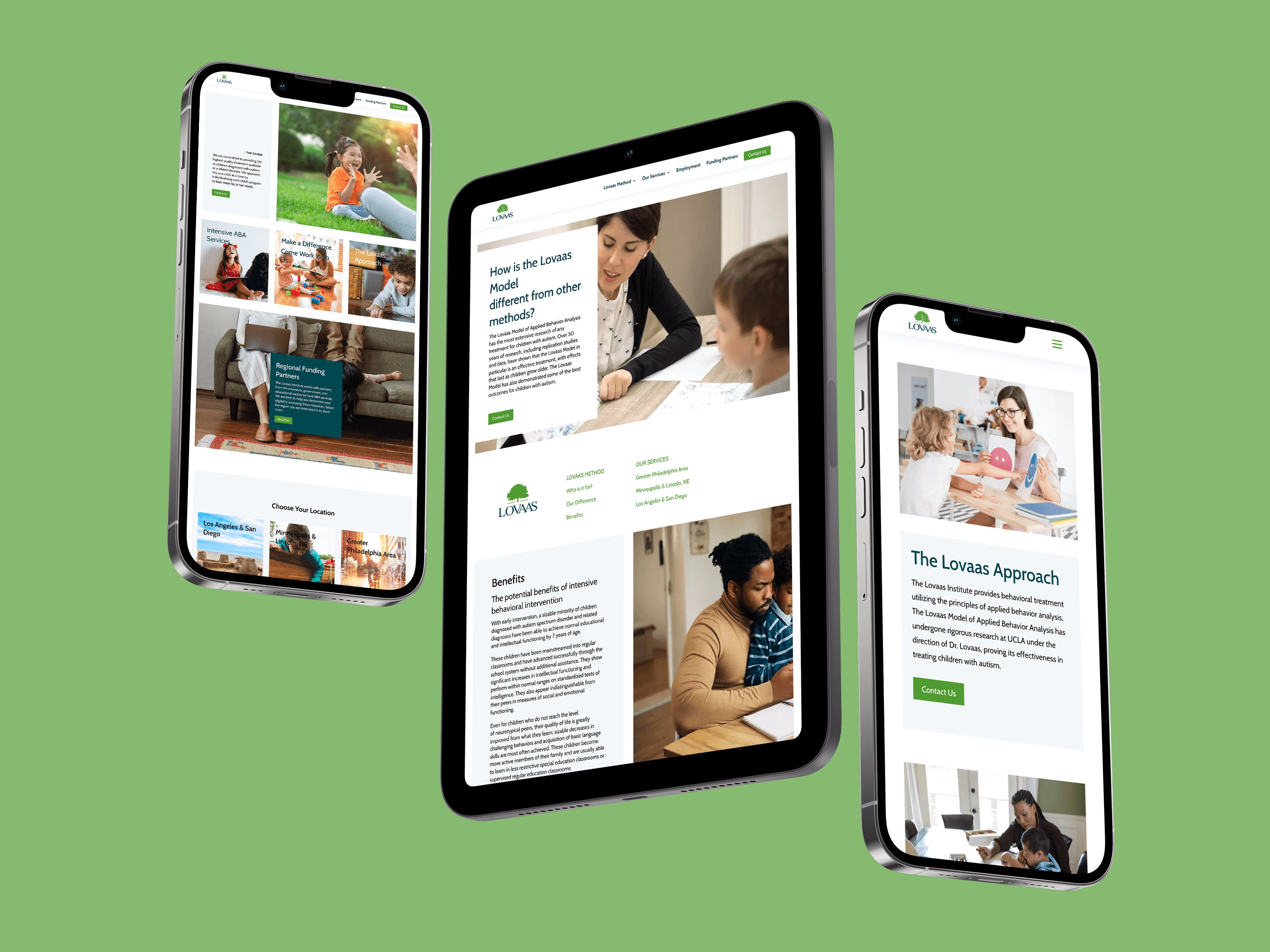
The moment the Lovaas Institute knocked on our metaphorical door, our branding and marketing experts were ready to get started. There were obvious elements we wanted to keep and enhance, and there were plenty of branding assets that also required a complete, from-the-ground-up build. Once the brand was established and the style guide was built, we got to work on the website, rebuilding it to showcase family-centric imagery, warm, inviting colors, and most importantly, the information families need to make the best decision for their children.
Rebuilding a brand that rebuilds families
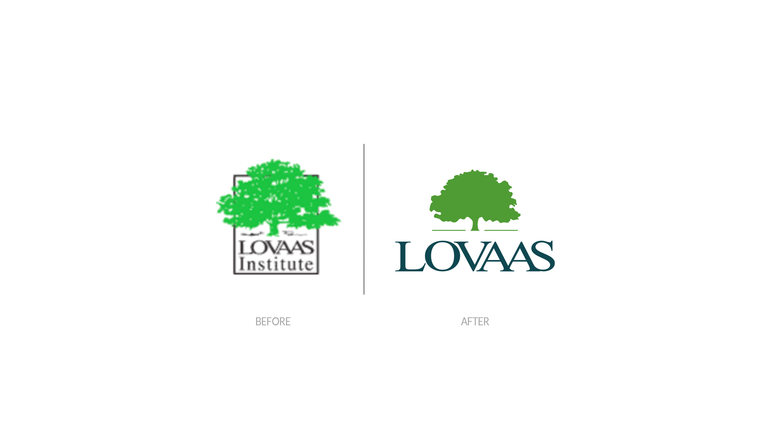
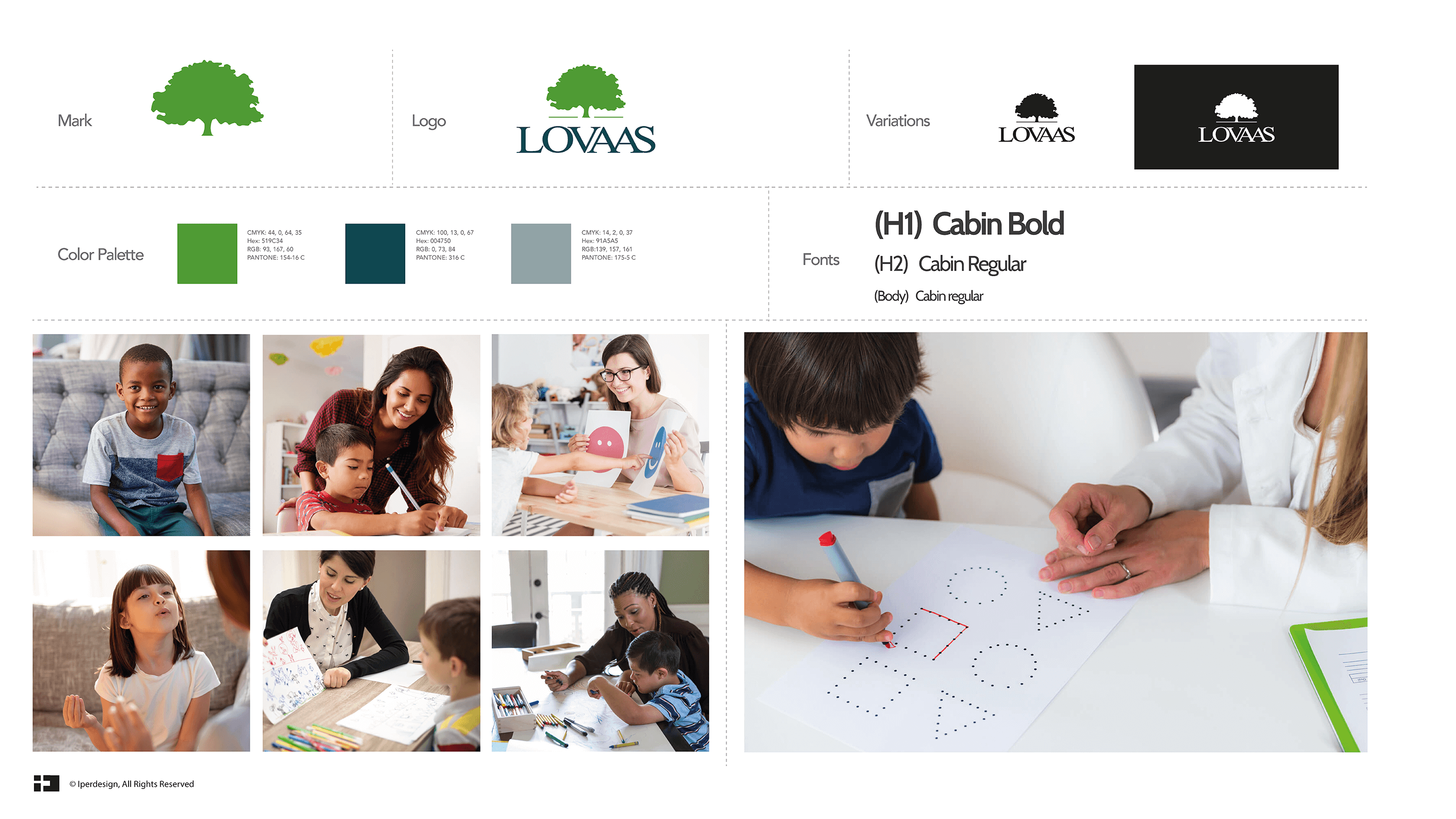
From the start, we knew there were branding elements we wanted to keep and simply enhance, including the warm green tones and the tree mark in the logo. Both were synonymous with the Lovaas Institute’s inviting presence and strong foundation within families, and our experts understood the importance of keeping those elements present. We also knew that we could do more.
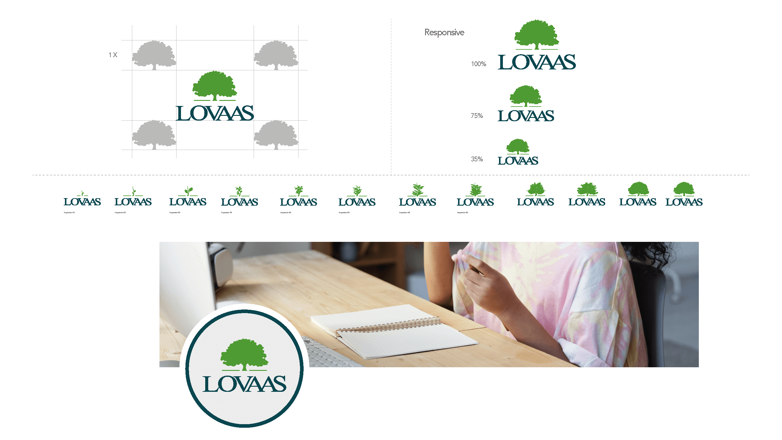
So our experts got to work with the color palette and logo. While we kept the warm, calming greens, we chose slightly different green shades that were vibrant but also soothing. Then, we got to work on the Lovaas family tree mark, placing the Lovaas name where the tree’s roots would be to represent that the Lovaas Institute was the foundation for helping families grow. Our design experts even animated the logo, showing it as a promising seedling that grows into a sapling and then a massive tree. This evolution reminds families of how their journey with the Lovaas Institute will help their families grow stronger every day.
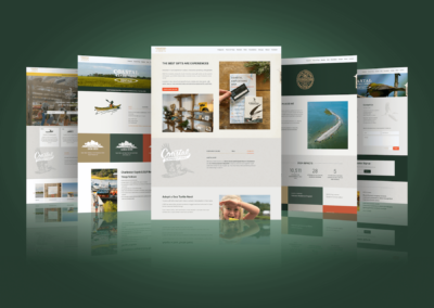
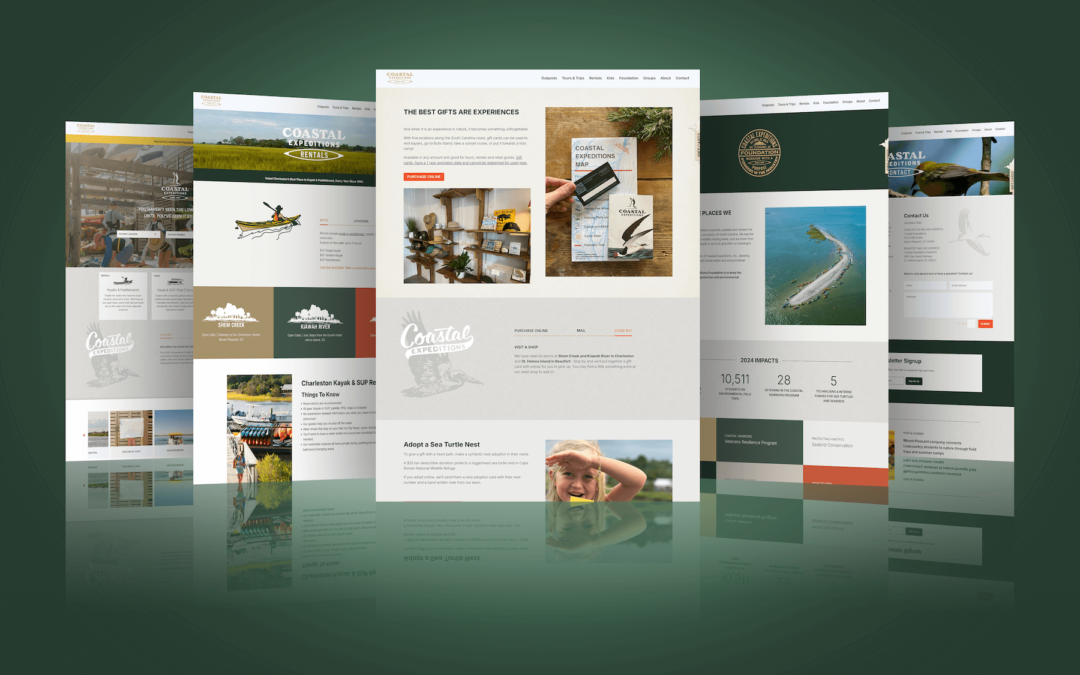
With the brand’s style redefined, along with a new, easily readable font, we got to work on assets—with the most important being the Lovaas Institute’s website. The website needed to be a place that soothed client anxiety by offering research, information, and ways to get in touch, but it also needed to have imagery that matched the Lovaas Institute’s work. We ditched the old Post-it note-backed design and self-snapped photography (mixed with some stock photos), and brought the website to life with vibrant, family-focused imagery surrounded by reassuring content that explains the Lovaas Institute’s work, research, method, and more. Each page served as an opportunity to reengage and reassure clients interested in enrolling with the Lovaas Institute before they ever picked up the phone for that first consultation. We even implemented a research library that allows clients to see that the Lovaas method is scientifically backed by hundreds of studies. With the website designed, we started to think about how clients would get to the website and interact with Lovaas Institute representatives.
Creating a Marketing Pathway to the Lovaas Institute
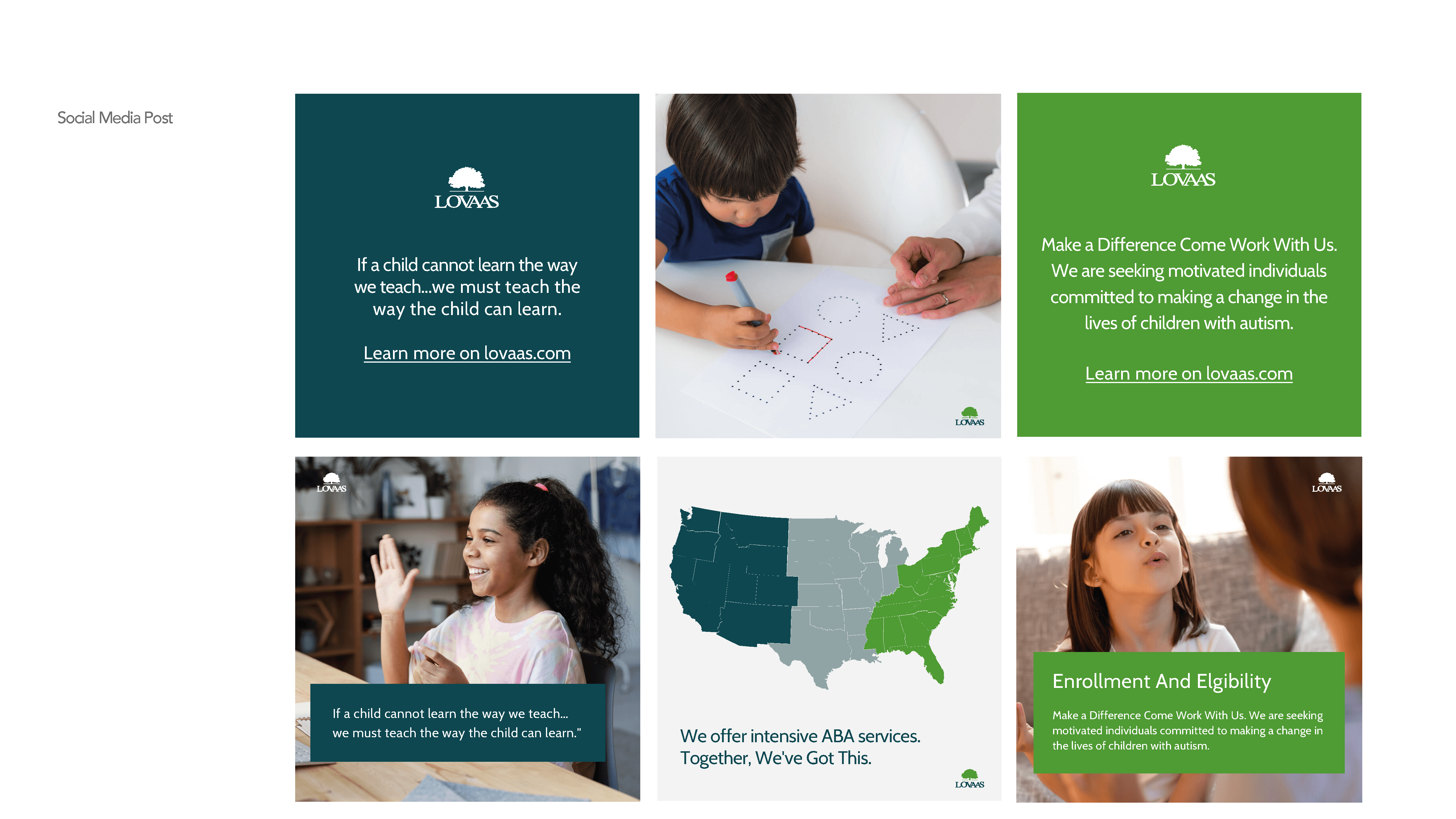
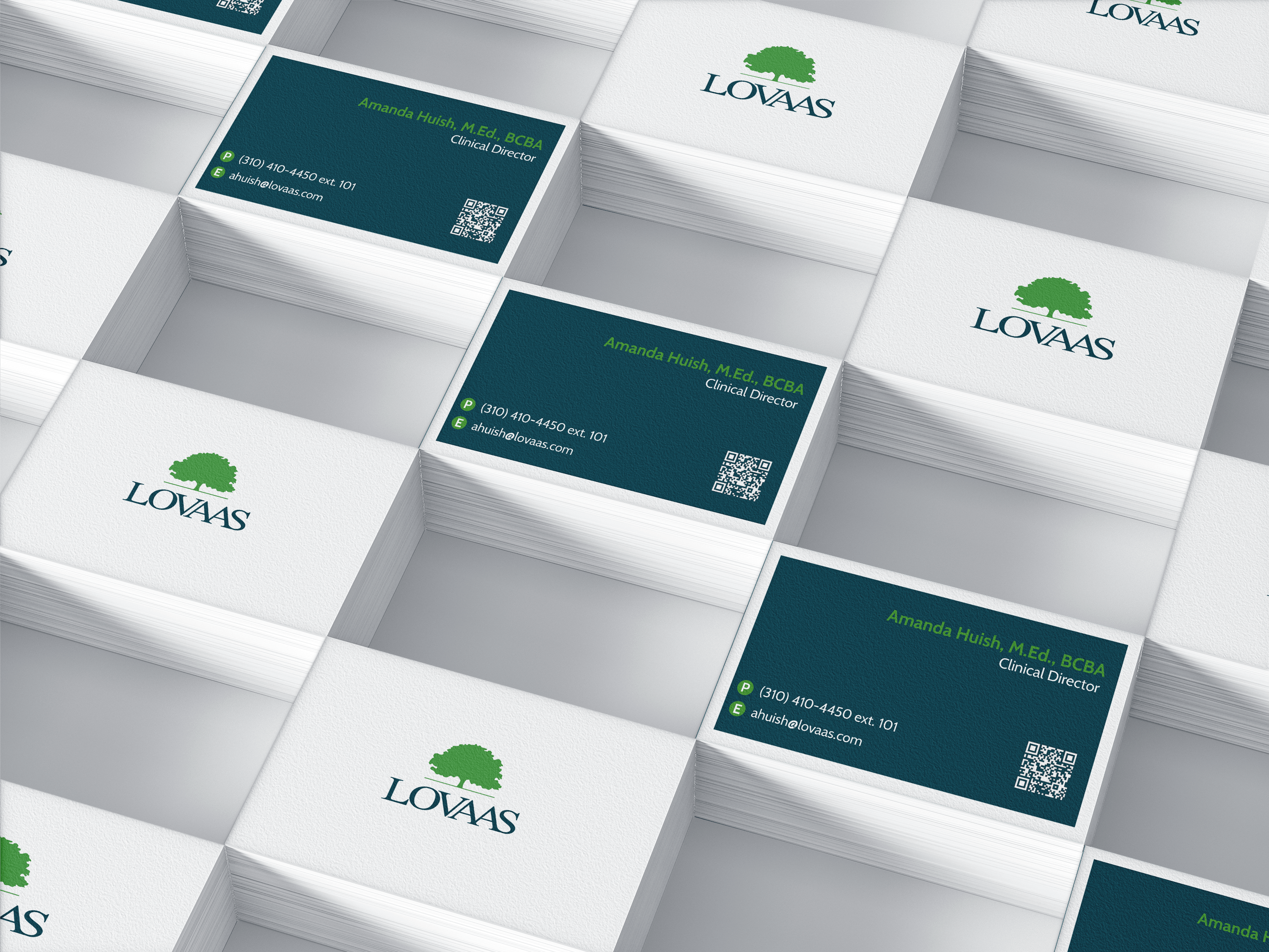
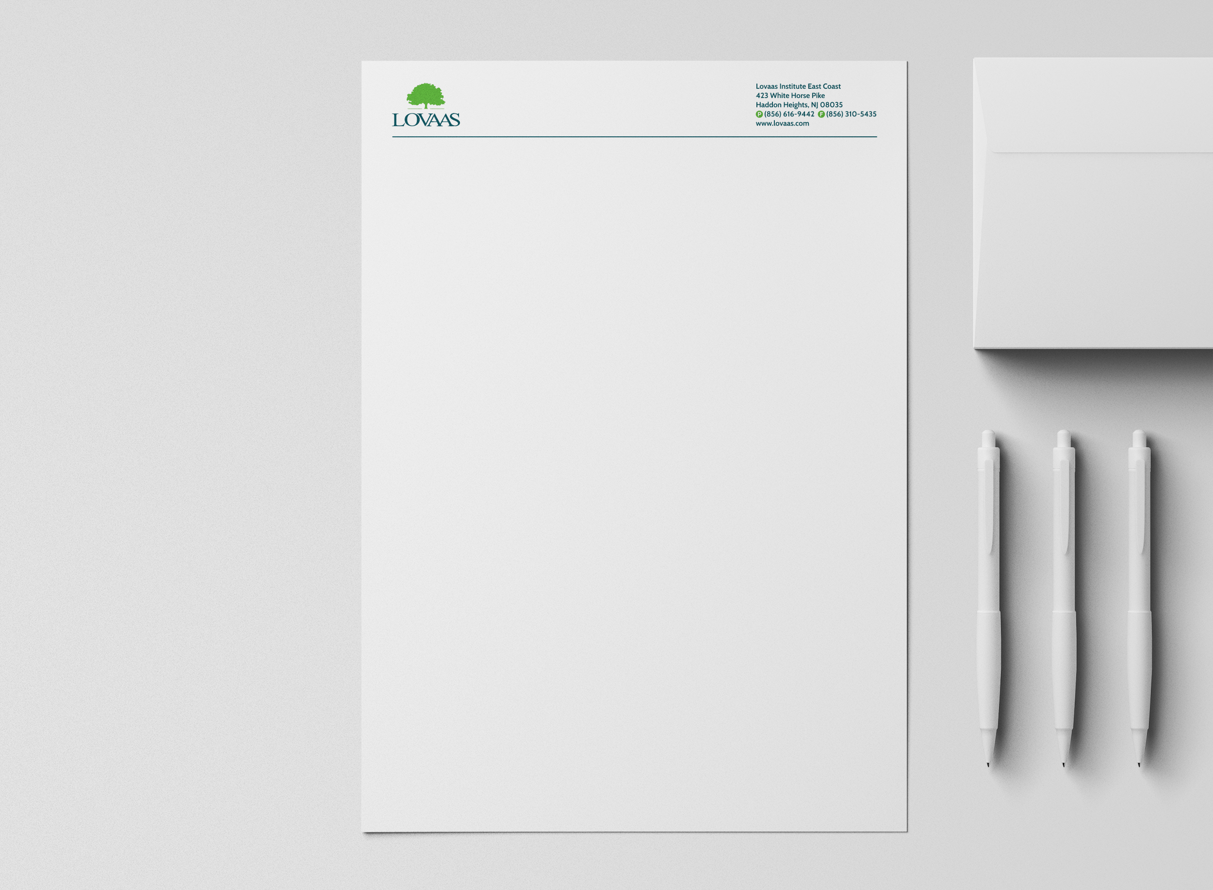
There is never a detail too small for us to consider, and our work with the Lovaas Institute is the perfect example of that. We know that the institute’s representatives are going to be working with existing clients and talking with potential new clients all the time, so every correspondence needs to represent the brand. Our strategists identified four important ways to carry the new branding into these connections—email footers, letterhead, business cards, and QR code landing pages.
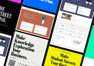
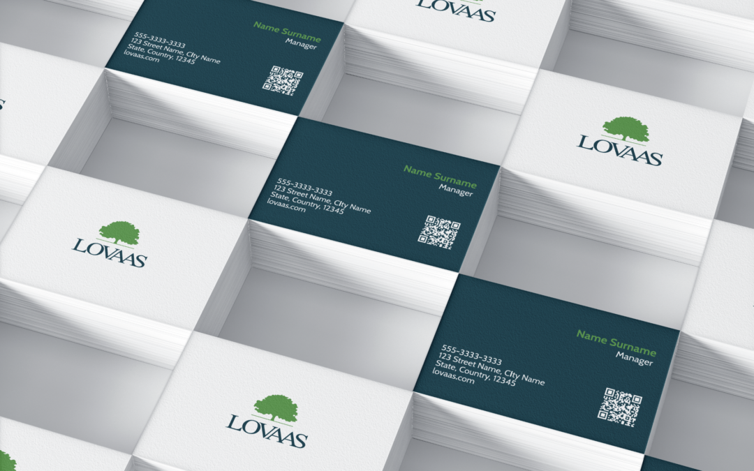
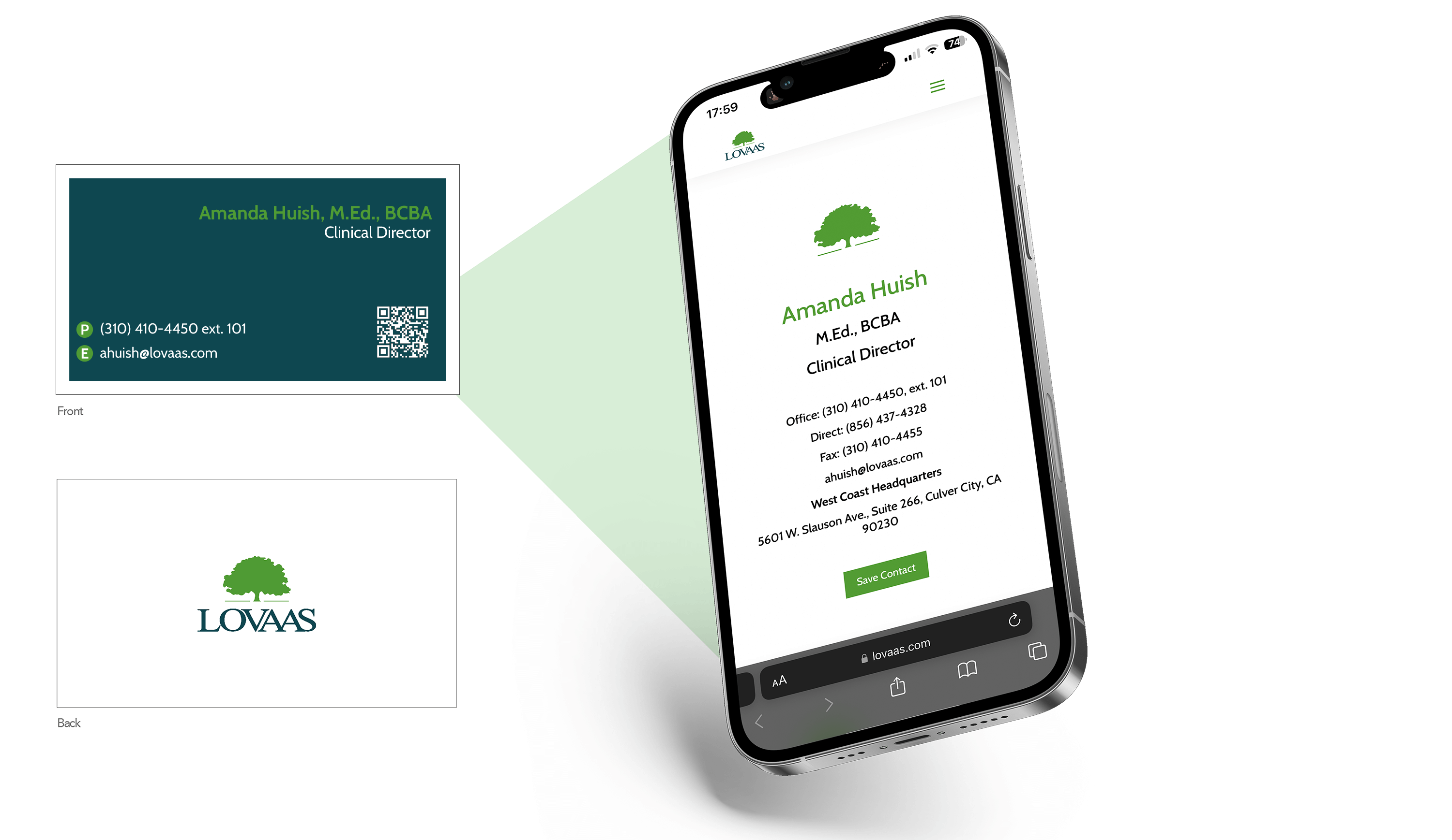
The emails and letterhead were obvious opportunities—we had a chance to put the new branding front and center with both new and existing clients, ensuring the Lovaas Institute’s presence was felt even before a contract was signed. The business cards and QR code landing pages offered a different approach. We wanted potential clients to be able to not only see the branding represented on the cards but also learn more about and connect with the Lovaas Institute representative they were talking to.
Each business card was fixed with a QR code that, when captured, would guide clients to a personalized landing page with the representative’s information on it. They also had the opportunity to save that information directly to their phone, ensuring they could easily get a hold of a Lovaas Institute representative if ever needed. Not only did this connect the clients to the Lovaas Institute brand, but it showcased the hard work that each representative does for the company.
The Result
Our experts left no detail untouched with the Lovaas Institute rebranding and remarketing. With every avenue of connection between the institute and its clients considered, we were able to create a branded funnel that brings clients to the Lovaas Institute website. There, they can learn more about the brand, be reassured about their decision to work with the Lovaas Institute, and ultimately, begin that first consultation.
Here’s what the President and CEO of the Lovaas Institute had to say about our work:
★★★★★
“We have received universal praise from our clients and employees regarding the look and communication of the website. We are in the process now of incorporating digital business cards and other personnel-centric touches to the website. Our employees are loving the new modern technology in their presentation of themselves at conferences and other professional venues…
