Giving Hollywood.com the Star Digital Design Treatment
CLIENT
Hollywood.com
SERVICES & SOLUTIONS PROVIDED


If you grew up in the 90s, you already know Hollywood.com. Not only was it the destination for Hollywood insider information, it was also the first website to list movie theater showtimes across the nation. Now, it continues as an entertainment website that offers insight into celebrity lives, red carpet events, upcoming and current movies, and so much more.
The Opportunity
There are certain expectations that visitors have when they come to a site like Hollywood.com. After all, if you’re going to talk about the stars, you have to look like you belong among the stars. Hollywood.com’s blog wasn’t meeting that standard with out-of-date colors and imagery, along with old technology and a lack of interface options that cater to visitors.
The Solution
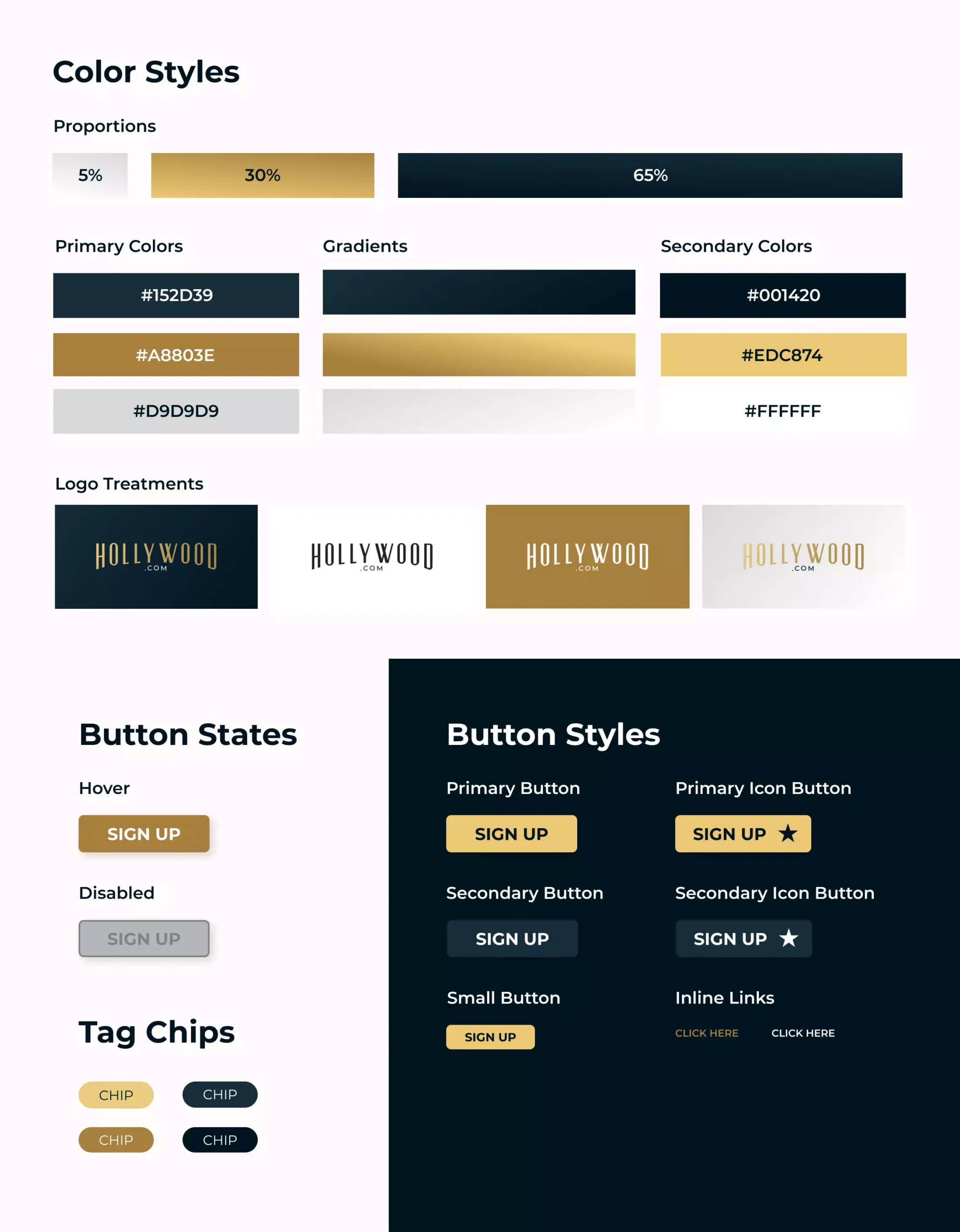
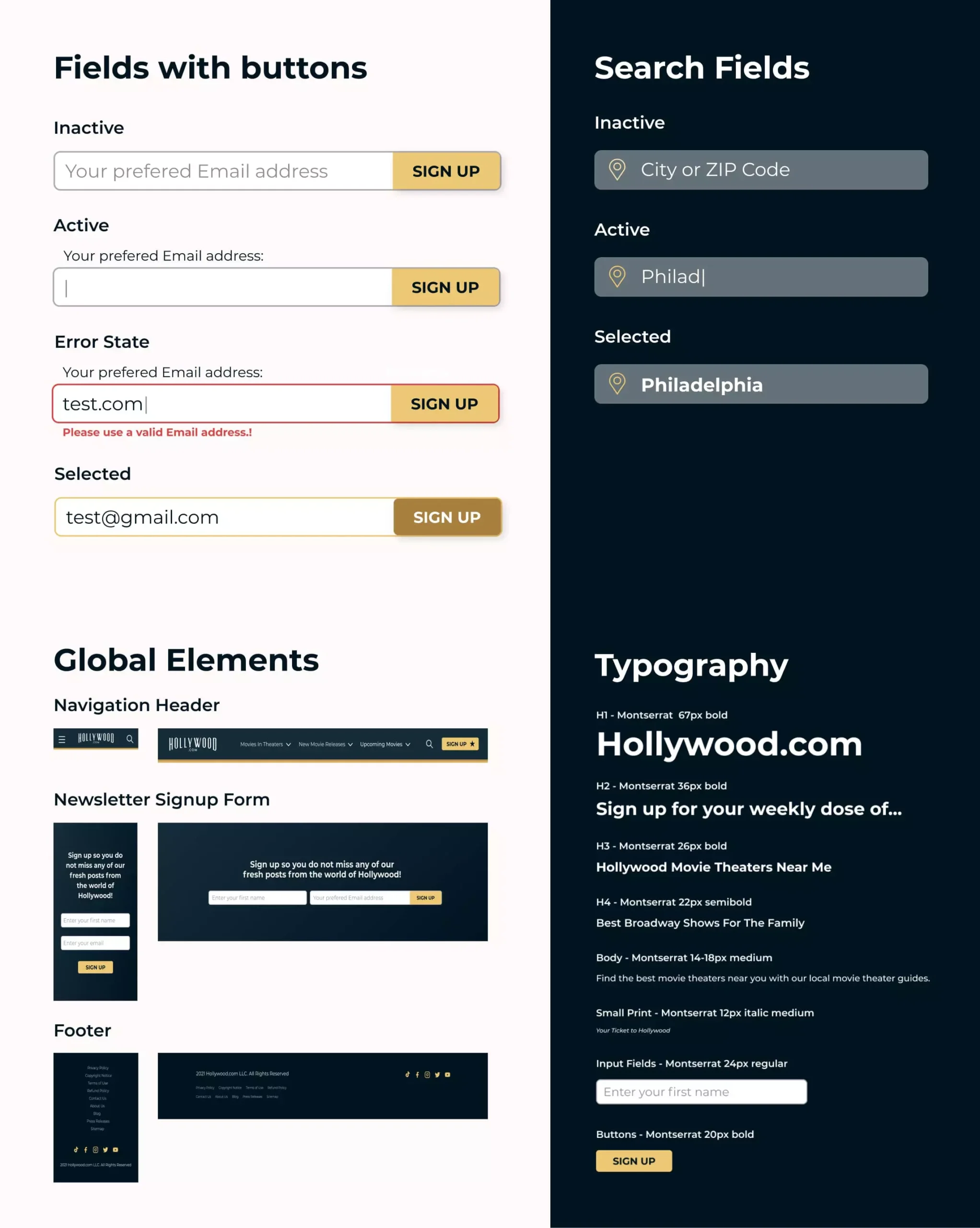
Hollywood loves a celebrity rebrand, and Hollywood.com’s blog was a perfect candidate for just that. We took the old WordPress blog with its cumbersome build, and we completely rebranded it into the news scroller that it deserved to be, complete with new color styles, dark mode and light mode features, and updated imagery. Of course, it wouldn’t be a digital marketing solution without ad space, too, and we built the site to seamlessly add locations to the page that didn’t distract from the content while still advertising for Hollywood.com customers.
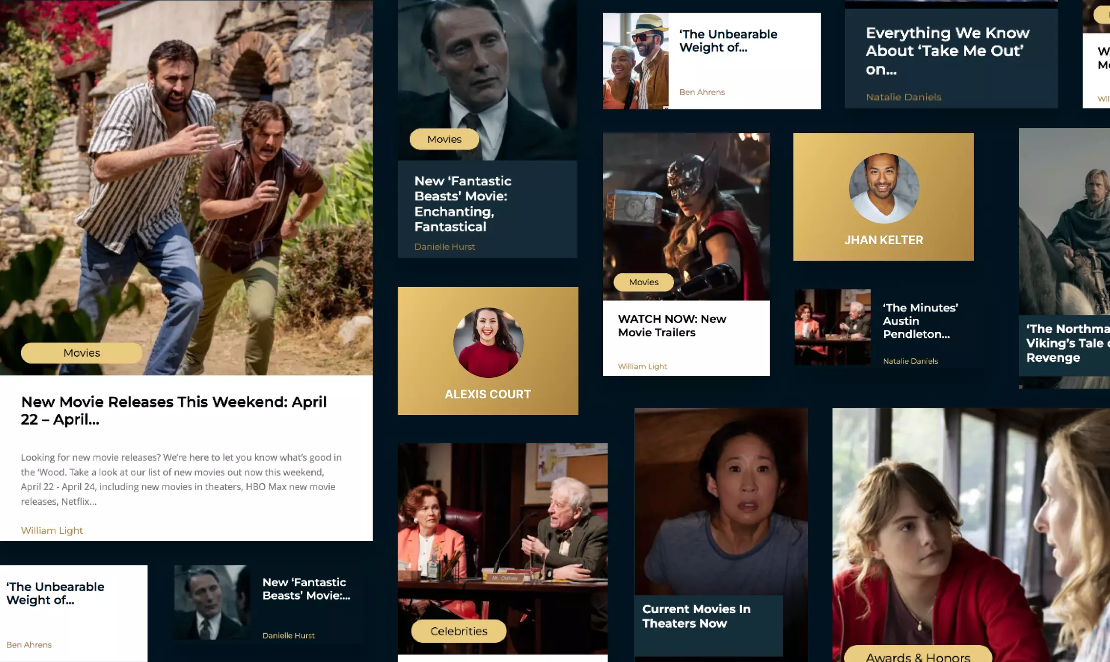
Rolling Out the Red Carpet of Digital Design
With a reputation as strong as Hollywood.com, we knew it was important to ensure we match the presence and timelessness of this brand with updated color and imagery deserving of the Hollywood name. To do this, we redesigned and restructured the blog to implement updated imagery and colors without losing that old Hollywood charm. We also ensured that the ad space on the page felt at home where it was located, so it was easily accessible to our readers without distracting from what they want most—Hollywood insights. Rather than a design rebrand, we call it a brand design enhancement—pairing modern design strategies with classic red carpet chic.
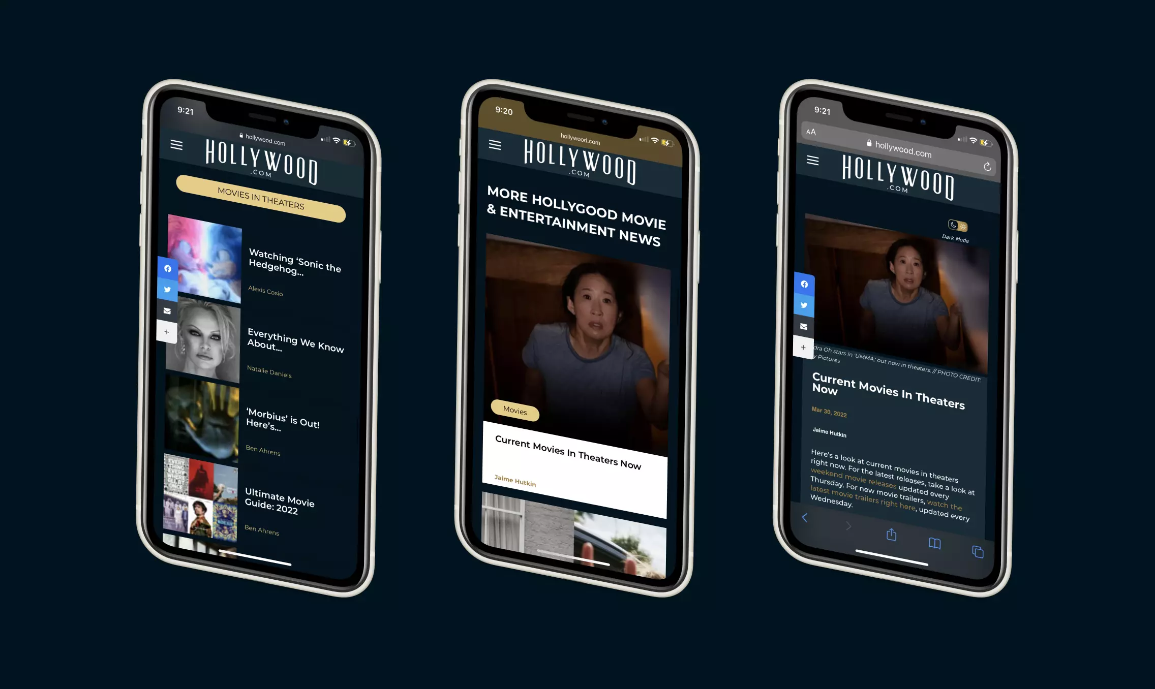
Meeting the Needs of Hollywood.com’s Readers
While the content of Hollywood.com caters to both seasoned readers and new movie enthusiasts, its interface and functionality didn’t. With new digital design trends being added every day, we decided to incorporate them into our redesign by implementing a Light Mode/Dark Mode toggle switch. While simple in its design, it allows readers to choose a mode most comfortable for them when browsing, which not only improves readership but it also improves time on page, bounce rates, and so much more.
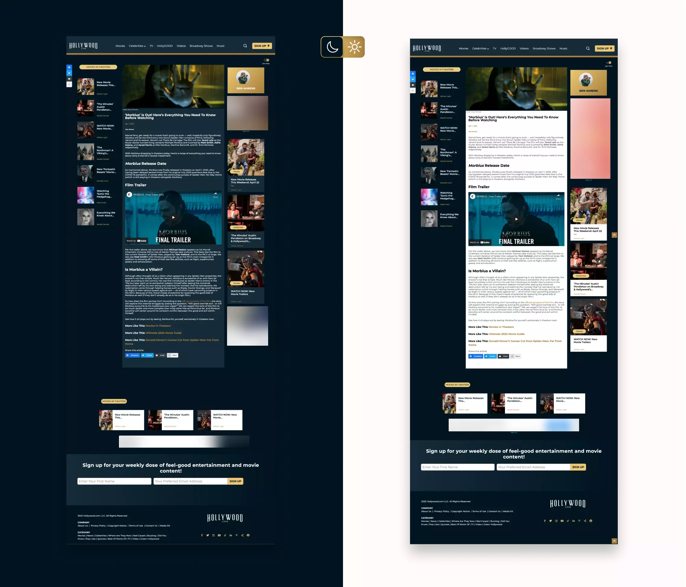
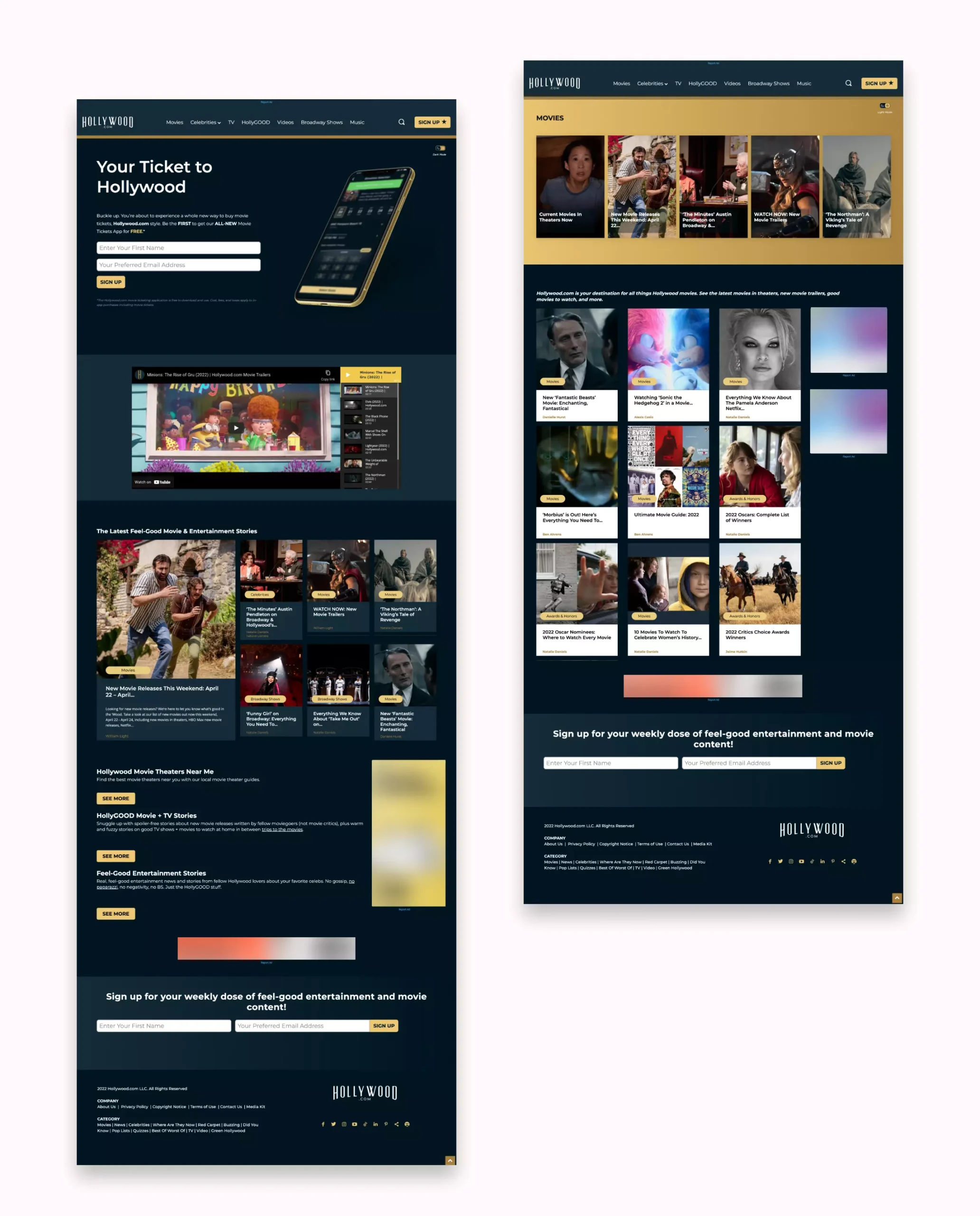
Throughout the project, we had one goal—pair intuitive, customizable design and easy-to-access ad space with Hollywood charm for the perfect digital design facelift for Hollywood.com’s news scroller. Now, their readers can navigate the must-read content on the page, engage with advertisements among the articles that interest them most, toggle between Light and Dark modes for easier reading, and enjoy that classic style they’ve come to know from this legendary website.
Visit Website
Technologies
