Building a Stronger, Family-Oriented Digital Brand for Oak Trust Properties
CLIENT
Oak Trust Properties
SERVICES & SOLUTIONS PROVIDED


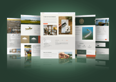
OakTrust Properties is a boutique, family-owned property management business that calls Charleston, South Carolina its home. They help people both rent and manage properties to ensure that owners can focus on boosting their ROI instead of the day-to-day details of managing and marketing properties.
The Opportunity
While OakTrust Properties is rooted in family, their website and branding lacked that warmth and strength that comes from such a strong team. The logo reflected the most fragile aspects of the oak tree—the leaves and acorns—instead of the unwavering power of the oak in nature. Beyond that, the website itself felt cold and unwelcoming, instead of projecting warmth and confidence.
The Solution
Recognizing they needed to prune some old creative, OakTrust Properties reached out to the digital branding experts at Iperdesign to build a new online presence, starting with their logo and website.
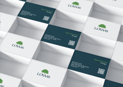
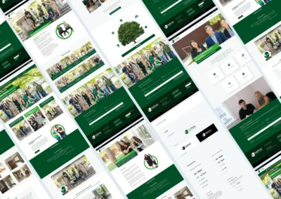
Reinventing the OakTrust Properties Logo
The oak is a powerhouse of a tree. It’s big, bold, and makes no apologies for the space it takes up. The logo needed to do the same. The font needed to command attention in both color and typeface, and the creative needed to reflect the strength of the oak. We combined a strong font with a circular emblem that represents wholeness and family, with the oak tree literally projecting its branches confidently from inside this circle. Not only is the logo powerful as it stands, but the emblem can be used across a variety of creative properties, allowing OakTrust to ensure their brand is everywhere from the website to social channels and beyond.

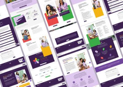
Embracing Family on the Website
OakTrust Properties understood the assignment: their customers want experts who care, and that’s why OakTrust is such a powerful property management company. They swapped the images of the cold exterior of a building with stunning photography—taken under the branches of an oak tree—that puts their family-oriented team front and center. Now, visiting the website, they’re no questions who will be helping you with everything from building an investment portfolio to listing your rental property. Every team member is invested in your success, and you can even learn about each expert on staff with their bios.

These visual updates complete with a new stylesheet, including colors, iconography and typography, plus important 3rd party platform integrations, gave OakTrust Properties a fresh, modern, and technologically efficient presence that puts people—both their team and their customers—first.

Visit Website
Technologies