Is this legible?
Machine learning is emerging as a powerful area in the also powerful, also emerging field of artificial intelligence. The legibility of fonts is very important when you work within design, and a perfect area to try to harness some of that power.
Our idea was to train an AI to categorize how legible an image of a default font sample is. It would create an algorithm that could do so, by using machine learning with deep neural networks.
We trained the AI by uploading 30 images of fonts and categorizing them by legibility as ‘Best’, ‘Okay’ and ‘Bad,’ based on various design elements such as line weights, angles, spacing, and general consistency.
Now, the AI algorithm can take new, untrained font images and give an educated estimate on whether the font has Best, Okay, or Bad legibility.
The machine learning was done by IBM – Watson Studio
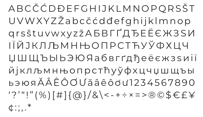
Best
This is one of 10 fonts categorized as having “Best” legibility. It was chosen for having no serifs, a consistent line-weight in each letter, and overall general consistency.
Our AI’s eyes were very happy when it saw this font.

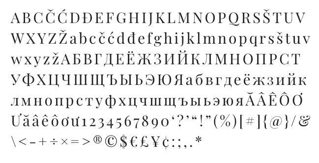
Okay
This font was one of 10 fonts categorized as having “Okay” legibility. This was chosen for the inclusion of serifs and variable line-weights inside each letter.
Our AI’s eyes were less pleased by this one, but it’s still legible.

Bad
This is one of 10 fonts categorized as having “Bad” legibility. This was chosen for having general inconsistency, some serifs, unusual characteristics, and unusual angles.
AI’s eyes… very mad.

Let’s experiment
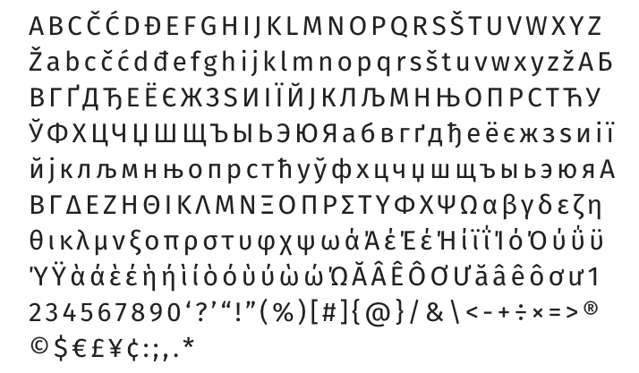
This is the font Fira. We have not categorized this one yet, but based on the lack of serifs and generally consistent line weights, angles, and spacing, we expect that it will receive a strong score for ‘Best’. It will also have with a weaker score for ‘Okay’, and a very weak score for ‘Bad’.

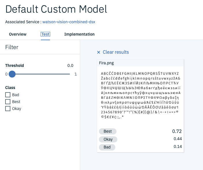
And the results are
The AI decided that it was fairly confident that the font Fira was ‘Best’, less confident that it was only ‘Okay’, and was hardly confident that it was ‘Bad’. This was consistent with our expectation, which means that our AI is as accurate as our human eyes!
Okay, that’s an exaggeration, but it was still fairly consistent with what we hoped. That is a positive outcome and evidence that the algorithm is working to some degree. In reality, this algorithm is no where near the quality of a human’s eyes. We primarily achieved our goal of learning a lot about supervised machine learning, and look forward to applying the fundamentals to a more complex application in the near future.
